I decided to explore the same subject, but utilizing my own style I arguably perfected in high school. While it is a lot more work to build up organically this much detail — and I am still a long way off from a finished piece of work — I feel it is starting to exhibit the complexity and details that I love to focus on.
Continue reading “Treant redux”Category: Artwork
Here you will find, you guessed it!, sketches that I have done over the years.
In the past few years I’ve transitioned to mostly digital starting out on iPad Pro with Procreate.app. However, I’ve recently bought a used (new for me) Wacom Cintiq 22HD Touch and Corel Painter 2019 (macOS) to my toolset.
Given I find other people’s sharing of their process hugely educational, whenever I post I do my best to show my work in all its stages. And there is often a time lapse of said progress added, too. Again, I find all of this shared elsewhere hugely educational.
Hopefully you find this posts as informative as I find others who do the same. And do not hesitate to reach out to me via comments or directly if you anything is unclear, or if you wish for me to fill something out with more details.
And remember to share the love by sharing links to my posts!
Treant
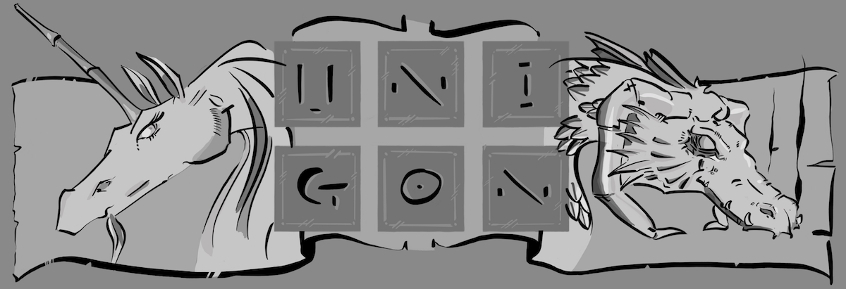
uni + gon
As this site is powered by the awesomeness of both unicorn and dragon – from whence the name comes from – I thought it prudent to create an image for each of these creatures as celebration. I had long ago done a quick pencil sketch of a dragon sleeping, which quickly resolved this afternoon into the below ink illustration. As for the unicorn, this came about rather originally and entirely via digital means. I rather like the ink stay, and I hope you enjoy them, too!
unigon on youtube!
I just added Unigon as a channel on YouTube. You will find videos of my work from start to finish using Procreate.app on iPad Pro using an Apple Pencil. If you have ever wondered what my process looks like, this is a good way to find out more.
Note, my own process is heavily influenced by Nikolai Lockertsen who is a professional concept artist. Further note, I’m not a professional artist. So when in doubt, I’d listen to Nikolai.
where next?
This originated as a few quick lines that more got down the impression I was seeking, albeit it missed some of the anatomical accuracy I had hoped for. Nevertheless, I’m pleased with the final image as I feel it conveys convincingly a rider and its dragon looking to see where to go next. Ironically enough, the rider took the greater part of my time to get right to my satisfaction, especially in terms of getting the saturation levels right. If you watch the video below, note that I added the rider only after the dragon which was already near its final, colored state.


