
Last weekend I started a new campaign by a local DM and sadomasochist (I’ll return to this in a bit) at Secret Lair of Chelan, and is only appropriate I started a new character, Root.
Background to Backstory
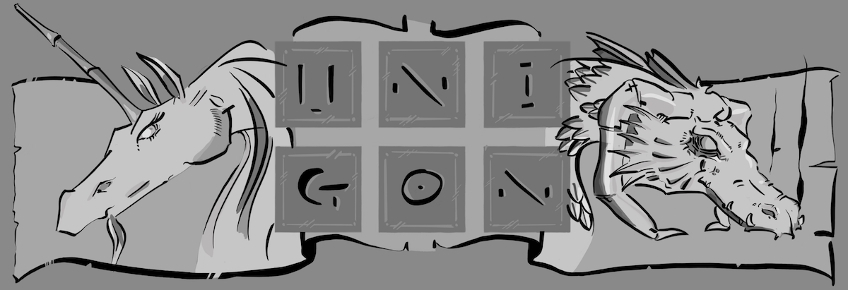
I have a confession to make. I was half tempted to just roll a Level 1 and re-hash one of my old favorites such as Unnis, the dragonborn sorcerer who loves cinnamon rolls and yellow wine, or Stone, my innocent warforged, my equally innocent fallen Aasimar paladin, Erel, or even my more recent Kazumichi, a kensai from Pathfinder but set to 5E rules. My rational at the time was that I was not sure how much time I would be committing to the drop-ins, and partly I had forgotten to come prepared and only had 60 minutes before the session started to conjure something out of the ether, my head, or in this case D&D Beyond.
But never one to back done from a self-induced challenge, I opened up D&D Beyond and threw proverbial pen to paper and out came Root. Root was largely just born out of the decision to do something different than what I normally play, which is focused on damage output at the expense of all other considerations. Some might call it a play-style, I think of it more as a player defect.
One thing I love about RPG is just the randomness of it all. It’s a place where the rules are more like bumpers in bumper cars, keeping you from going entirely off the track, but not meant to stop you from trying. The roll of the dice force you, pardon the pun, to roll with the punches and improvise on the spot. And creating a character without a clear picture in mind at the start, it’s fun to see where you’ll end and who’ll find at the end of it all. It’s also lazy, but I’m not going to admit to you, dear reader.
Backstory, The Making of
As I was filling out Root’s character sheet and desperately trying to not min/max him to death (did I mention that player defect of mine?), I came to the section where you are asked for backstory. Again, I did not have any specifics in mind with Root other than to play a class I had not played before. And while I did not think backstory was going to be entirely relevant to these gaming sessions, I thought some amount about loose threads that would help me flesh Root out once we got rolling.
I tend to just play characters that act like I would in real-life; in equal parts due to I’m not creative in that way, partly due to I’m autistic and theory of mind is rough for me, and partly just because I hate having to pretend to be something I am not, even when given permission. I learned decades ago from my on the local high school stage, and I might add in my own estimation phenomenal success, to just act from parts already in me. Aside, I wonder what it says about me that I played Dr. Bester from Up the Down Staircase and Horace Gilmer, the prosecuting attorney in To Kill a Mockingbird? Truth be told, I was/am a horrible actor but I did have both 300 pounds of mass and a lot of bottled up teenage anger that was a good basis for parts that required a thunderous voice on stage. But I digress. Root started to form from my own persona living as a stranger in a strange land, sans the messianic undertones that reference implies.
The Seed of a Backstory
While we’ve been 10 years in the Chelan valley, I’ve worked remotely from a home office the entirety of that time. And given we have not been able to have children, outside the raising of our two Great Dane dog’ters, Sora and Kumo, we don’t have a natural circle of friends which might occur organically in the daily grind of raising children. Compounding all this, I’m reserved and introverted, and it’s not hard to imagine Root as an interloper of sorts. And of course, this is not a new sensation but one I’ve felt the entirety of my five decades. Add to fact that I live clear across the country from where I was born and raised, and you can start to see the similarities to myself and Root as a far traveler. Even the random selection of a “bird flute” as one of his instruments he plays as a Druid, has turned into a part of a deeper backstory. Gawd, I love this game.
The Backstory
I imagine Root as an odd child elf growing up. His real name is unimportant, since the name he earned is the one he bears today. He was curious as a child, insatiable to get to, well, the root of things. He never stopped asking why, or digging, quite literally and proverbially, at things till he understood the deeper meaning. And while others named him Root for these reasons, as he grew older the meaning took on new meaning. He became the friend to the forgotten ones, the unseen ones, the ignored ones of the forest. And for these, the roots are where their homes start and extend. For the mice, for the birds, for the toads and frogs. Even to those that burrow underneath, the worms and the spiders and the insects. He is friends to them all, even as his heart is dearest to the simple wood mice and sparrows who keep him constantly apprised of the goings-on, both under foot and over head. And while he’s very adept at squeaking his way through a conversation with mice, he indeed quite literally needs his bird-flute to communicate effectively with the fowl folks he meets. And if you think there was a play on words in that last sentence, you’d right. Some fowl are really foul; just look up the reproductive behaviors of ducks to learn what I mean. But I digress.
Root has now traveled so far from where he was born, under bough and over root, to find himself in a new land with new people. He never quite settles, even if he lingers in a place for along while. He cannot help himself in this way. Curiosity always get him, making him wonder what is past yesterday’s sunset or this morn’s sunrise. But now, he content to discover what the folks of this wayward tavern and its’ slime mold infestation have in store for him.
Making of a Portrait
Given that I share so much with Root, it seemed fitting I would sit for my own reference photos. Also, I’m inexpensive (free) and available. Also, I’m sure I’m a bit vain.
I started with a quick portrait generated by AI. It’s actually amazing what you can produce with a few words in under 30 seconds from your computer. I cannot say it’s a horrible portrait for Root, but it lacked the more rugged nature I envisioned for him. Nevertheless, it was a good start with a starting session only 10 minutes away.
Aside, I absolutely have zero issues using AI using it. (Okay, I have concerns but I’m also very pragmatic and fairly nuanced given I operate in this space leveraging AI for mental health therapy as a co-founder/CTO). And I appreciate the sensitivity people have around it, especially established artists and creators whose specific style or tone can now be duplicated with a few strokes who were hoovered by Big Tech with nary a thank you let along contract for royalties based on IP. But toothpaste and trying to put it back in and all that jazz hands apply. Aside, if you love an artist or author buy their work and patronize them; don’t use AI to plagiarize their style, no matter how tempting it is. PSA done.
But in all seriousness, what I love more than playing a character is illustrating them. So, the real secret why I scrambled to roll a new character was that I wanted a seed of an idea for my next piece of artwork.
As noted above, I play characters that represent aspects of me. There are universal themes such as free will that come up in all of my characters. And sometimes you can see me more directly in a portrait such as with Kazumichi (or 和道) which is the name I adopted for myself while living and working in Japan. But I think Root may be the closest I’ve come, at least externally, to largely being my alter ego, is really just me as I see myself in my fifth decade of life. I am not nature person per se, but I’m most open under open skies and open roads. I grew up being bullied, and I see in myself a pattern of having both a soft spot and protective tendencies to all of us who are unseen or ignored, or are underestimated and not part of the mainstream. In this way, Root’s connection to the small mice of forest and field is this connection to myself.
So I stood in for Root. It did not hurt that I had mountain-man beard already grown in. Throw in a walking stick made by father, and a Carhart outdoor shirt and I look the part of a modern-day Root. A quick selfie with my phone and I had all I needed to get started. Receding hairlines be damned, I gave Root the one I wish I had, along with a fuller beard.
Most of the evolution of the illustration is in the lighting. I ended with two light sources in the end, largely to just help Root to stand out from the darker forest behind him, but also to help boost the idea that this character lives in a world unlike ours.
For myself as an artist, there is no point doing fantasy artwork if it just looks like a picture of a woodsman somewhere in Washington, so the purple lights allude to something magical or mystical, something just out of sight by the viewer.
What is the source? I honestly don’t know, but I suspect Root will out. It’s his nature, after all.


P.S. While I cannot give specifics as it would be spoilers for future adventurers who join us at the tavern, I will say any DM that #tpk’s everyone in session 0 of an introduction to 5e D&D is one sadistic insert-non-PG-words-here. Thanks, DM-who-will-not-be-named.
P.P.S. Yeah, Root died already. But then the DM healed us. Because he’s an upright DM that did not want to get clobbered over the head with a long stick thing.


