
Back in February of 2018, I happened to be at CR Sandidge sipping on a glass of wine while sketching. As fate would have it, Miss Caris was also there to visit her mother, Athena. Now, for folks who don’t know me, I tend to fill in my time doodling things like eyes, trees, fantastical beasts, but especially dragons. Oh, I do like me some dragons.
Given that both me and Miss Caris were sharing our drawings with each other, the conversation eventually moved to Sabrina’s love of dragons and Athena’s desire to have a dragon-themed label for Sabrina. We talked some more that evening, and I told Athena I would happily design something for them. She said yes, and the rest is, as they, history.
I’m writing the below on the eve of the Sabrina bottle grand debut scheduled for April 20th, 2019. While I will not be able to attend the debut evening, I wanted to share a bit of how we got from that fine evening well over a year ago to today. The below will progress in chronological order, starting from concepts and ending with the final design; hopefully along the way I can share a bit of how we made it through the various turns to where we are today.
Concepts
When I got home I immediately started drawing various roughs of dragons. As we had not yet discussed specifics, I was trying out various styles and motifs that I thought might work on a wine label. I tried a few cute and cuddly critters around themes of fertility and contentment. And if you look carefully, you might even find one or two concepts that look a bit like a bunch of grapes! And if you are curious, I wrote a post on how I took these concepts and further fleshed them out as personal projects.

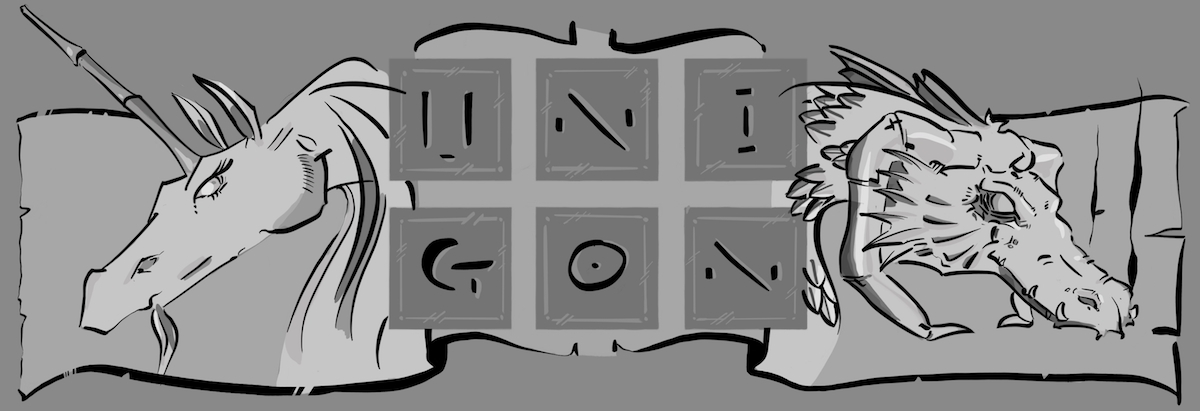
As we I started sharing my initial ideas with Athena and Sabrina, it came out that they wanted a more Asian dragon. When I think of Asian dragons, I imagine something akin to what you might see at a Chinese New Year festival, large head like a tiger and a long, sinuous body that tapers to an end like a snake. So I started moving my ideas along these lines with the help of Sabrina who shared with me dragons she loves.

Dragon Emerges
I knew that having the dragon wrap around the bottle would really help sell the concept; and I thought it would really make the Sabrina stand out amongst its peers on a wine shelf as something unique and special. Below is one such idea where we start t see a more asian dragon emerge, with more rendering applied as we start to lock down on what does and does not resonate with all of us.

At this point, we had a good direction to proceed. An asian dragon wrapping around the bottle; but, as evidenced with the above versus the final design you can tell that we were not satisfied with the dragon’s head, a prominent feature of the design. I still liked the idea of a dragon as a grape, as so I took this general shape and turned it into the below design concept.

Its All in the Details
Given that everything to date had been done as a raster image (the dragon is just a lot of pixels), I needed to convert everything to a vector image for purposes of printing. This is an entirely different workflow than how I normally work with my artwork, but vector yields much better results when you want to print something that will require a lot of little adjustments to scaling, et cetera.
The below is a version that was getting close to the final version. You can see that I’ve extended out the horns of the dragon, and added visually interesting patterns to make it more tactility given that the final print would only include a few colors – I could not rely on shading to help achieve the results I wanted but instead shapes and lines.

We already knew that the we’d use the metallic ink for the logo, and I wanted to that ink elsewhere. So as the design emerged, the idea of the dragon conjuring an orb fit well with the theme, and would allow me to use this ink to help harmonize the dragon with the CSR logo.
But beyond that, we did not quite know what color(s) to use the for the dragon. And this is not as straight-forward as if I were printing to paper. On a wine bottle you have different colored glass, and the color changes on whether there is wine in the bottle or not. So finding a color palette that would work in all these situations was not straight-forward to say the least.

While we did settle on a very simple palette of white, I would still love to do a run of bottles with a bit more more color. The below is my version of color that I really like.

An artist is never really done, and that is no less the case with Sabrina bottle design. I was not satisfied with the amount of detail (or lack thereof), and I had a lot of issues with a solid white tail seen in the above image. So I went back one weekend, and spend time refining details and redoing the tail entirely to better balance with the text.

In total, there is something like 80+ hours of love poured into the design over the course of 6-8 weeks starting in February of 2018. Since then I’ve worked with the printers and was ready to go for Athena and Ray when they were ready to finally bottle Sabrina. The day is here, so I hope you enjoy a glass or two – my only hope is that my own art pairs well with our preeminent artist and winemaker: Ray Sandidge.
Enjoy!

About the Artist

I currently reside in Manson, Washington with my partner and our two great danes. We are very fortunate to live near her parents, as we moved out here for a slower pace of life, and still hope to start a family of our own in this lovely valley.
My day job more revolves around being the chief technology officer for an edutech startup called Varsity Tutors, so it may seem a far stretch for a person with my background to design a wine label, let alone draw a dragon. But I have a lifelong passion for creating art, and I grew up with equal passions in physics and mathematics as I did in illustration and art; albeit in high school I started steering toward engineering as my career path. Alas, that is for another story. Suffice it to say, I had experience in the past with publishing and graphic design from the mid 1980s when it was possible with a Mac and laser printer to do it yourself out of our basement. And while most of my professional career is centered on technology, I’ve worked very closely with designers and artists through out that time and thus have a strong working knowledge of process and technique. While I would argue I’m more artist than designer, I did have the distinct pleasure of designing Chelan Valley Family Medicine’s logo in recent years.
I’m looking forward to doing another wine label for C.R. Sandidge scheduled for next year. And I’m always open to chatting if you have ideas you want to see come to life, dragons or otherwise! Please do contact me!
One thought on “Sabrina”