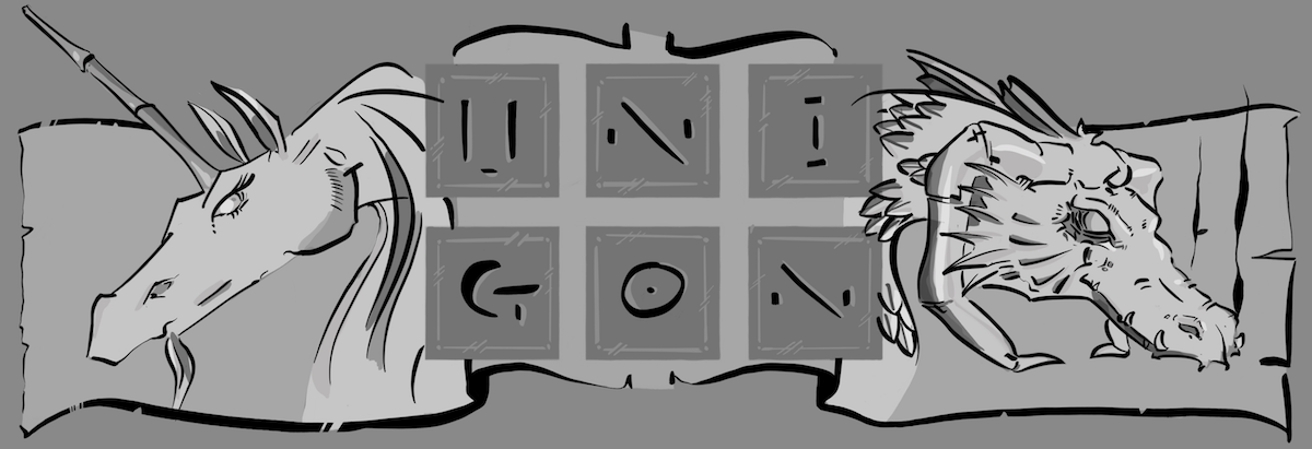
Awhile back, seemingly almost two years ago, I happened to be sitting at one of my favorite wineries with my iPad in-hand. As I oft due, especially in crowded spaces, I was engrossed in sketching while trying to ignore the cacophony that is, to my ears, humans in a crowded space.
Out of the periphery of my hearing, the co-owner was sharing with Marit and family how they were thinking of creating a new label for one of their wines. They had named two wines after their daughters, and the wine named after their older daughter’s had as of yet had nothing but her name on the bottle. As it just so happened, their daughter was fond of dragons. Dragons, you say? Dragons! It was at this point in the conversation that my ears perked up, put aside any concerns around random human interaction, and inserted myself into the here unto ignored conversation. As it just happened at that time, I was doodling a few dragon heads as is my wont when I cannot imagine much else to draw. One thing led to another, and we ended up working together on a project to create a label for their wine.
I ended up creating a number of rough concepts, trying to find a style and concept that would work well for both their daughter, who helped guide my hand, along with fit the constraints of being printed directly onto a bottle. For good or bad, I started out doing concepts in a raster app (Procreate.app), which I had to ultimately translate to vector for the printers. I will happily share more once the bottles are printed (later this year?), and I’m comfortable sharing a bit more on those specifics. And in the meantime, I had all these concepts just laying around. So while I was at Norwescon 41, I got the idea to take each of the concepts and render them more completely. It took me a bit longer than the few days at the conference, but I eventually rendered each of these out using slightly different techniques till I got to a much more painterly approach in the last two.


By my nature, I tend to have an illustrator’s approach to my work with strong line elements. But as I’ve matured, I’ve wanted to move away from this style largely as way to push myself as an artist. That said, my first few attempts at rendering show my strong inclinations to line.


While I’m super comfortable with strong lines and solid colors, as noted above, I’ve wanted to move away from this approach to capture a much more painterly feel. The below two renderings are my attempts to push what I’m comfortable with, and while I can already see what I’d do differently, I’m fairly comfortable with these two attempts, especially the latter one.


And for those interested in seeing a bit of the process from beginning to end, below is a very short 40-second time lapse of me creating one of the above pictures. I hope you enjoy!
This is a slightly longer edit of the last of the dragon concepts at just under 3 minutes. At some point I should consider adding narration to these videos; let me know if you agree. 🙂


2 thoughts on “Dragons, Dragons and more Dragons!”