flame-broiled unicorn and dragon drenched in awesome sauce
Category: Artwork
Here you will find, you guessed it!, sketches that I have done over the years.
In the past few years I’ve transitioned to mostly digital starting out on iPad Pro with Procreate.app. However, I’ve recently bought a used (new for me) Wacom Cintiq 22HD Touch and Corel Painter 2019 (macOS) to my toolset.
Given I find other people’s sharing of their process hugely educational, whenever I post I do my best to show my work in all its stages. And there is often a time lapse of said progress added, too. Again, I find all of this shared elsewhere hugely educational.
Hopefully you find this posts as informative as I find others who do the same. And do not hesitate to reach out to me via comments or directly if you anything is unclear, or if you wish for me to fill something out with more details.
And remember to share the love by sharing links to my posts!
Kailynn is a half-elf who comes from an affluent merchant family only find herself on the road after a devastating loss of both her husband and child whom she has buried both. Now without family, but through her tragedy, she has found a new purpose to find and heal those in need.
After consulting with the person for whom this was created for, we felt the above actress, while recognizable within the fantasy community, nevertheless was a good archetype for the portrait we wanted to create. She has a particular quality about her that I think represents those elven qualities of beauty, while drawing in the viewer as she look back to her past even as she is turning toward the light and her future.
I wanted to have her wearing some that was both elegant, given her background coming from a merchant family, but also something practical and somber given where she is coming from great loss.
I opted for a more muted color scheme for Kailynn, but tried to bring in highlights brought in from the rim lighting as a nod toward the hope is looking for on the road.
Forgotten Realms’ Eladrin including fey elfs who, after centuries of living in the Feywild, have adopted to their new existence including the ability to change their appearance to fit their mood, assuming characteristics of the season.
It’s a great concept, especially as an artist, as it gives me a chance to portray a single character multiple times, all with different color scheme and emotional subtext. While I’ve yet to do that with this character, I wanted to incorporate Autumnal colors into a female.
I followed my typical process of sketching out what I wanted, then quickly blocking in values while adding details till I was satisfied I had enough to begin the coloring process. As with previous pictures, I used a gradient map to help establish a foundation. I then added a color layer over top, knocked back to about 20% opacity. I did a lot of additional layers of Add and Multiple as I tweaked the original values a lot to bring out details I did not have originally. You can see this specifically with the hair which had no highlights in both the gradient map and values, but you can see in the other versions.
As with Stone, I started playing a bit of D&D 5E after supporting Camp D&D Online on Kickstarter. Whereas Stone is a bit of a stretch for me as a melee fighter, Unnis is entirely my jam: magical glass canon.
Given that I’ve not played D&D since the 2E, I opted to go with Dragonborn as a race. And more so, I elected to be a sorcerer given that, too, is new to me, at least for pen-and-paper D&D.
At the moment, Camp D&D Online is largely one-shot games so some of the role-playing in a campaign setting that would normally span multiple, even dozens of play session, is absent. In this regard, you can certainly approach the games as largely an opportunity to go min-max and hack-and-slack play-style. Nevertheless, as much as possible I wanted to have a backstory for Unnis with some thoughts on how I want to develop the character, even largely just for my own entertainment.
Unnis was excommunicated and driven from his clan when his latent sorcerer powers emerged rather suddenly in his teenage years. Unaccustomed to his ability to wield magical forces, in a moment of lapsed judgement he loses control resulting in the death of a clan member. At first he sought solace amongst the cities of the other races, but being dragonborn, he was largely shunned as both outsider and threat. For the past decade he has lived largely in the wilds, lost in his own thoughts as he wrestles with his past while seeking atonement and reconciliation with his clan. Years on his own has given him a lean fighter’s physique, although he is more prone to deep contemplation and quick wits than taking on a more direct route to conflict resolution. My hope is to eventually multi-class, and have Unnis take on the paladin class as he seeks to redeem himself in his and his clan’s eyes as a means to atone for the mistakes of his past.
I found it challenging, at first, to figure out how to tackle a portrait of a dragonborn. Without any obvious references, I resorted to using the skull of a bear as the basis for his headshape. I’m actually quite pleased with results of this choice, as it pushed me to create a dragon-esque features that are not a repeat of other dragons I’ve drawn in the past.
Bear skull
Baby crocodile
Lizard
Artist
Some of the reference photos I used to draw inspiration from in order to create Unnis Kilyax.
I took my usual route of first establishing composition through line-art. Once I had a good idea of the major elements, I blocked in rough values. This helps me understand if things are working at a macro-level without a lot of fuss or muss. It’s pretty trivial at this stage to change lighting in a matter of minutes if I do not think things are working. Once I get my values roughed in, I just start to refine my values while removing lines till the values themselves take over with their own shape language.
While I have, in the past, done a more painterly approach of just blocking out the shape language and values at the same time, I’ve found that my brain just loves working with lines first. I keep pushing myself to not rely on lines, but for now this seems to yield the most consistent results for myself.
I will continue to refine and add details to my values till I feel I have all the details I will need before I move on to adding color. I opted to using a gradient map as my first step to ensure that as I apply color using a color layer, that I avoid the pitfall of coloring over grays as my values. That said, I also develop my values using grays as its just easier to select grays from a colorwheel. Alternatively, if you do not want to or cannot use a gradient map, then minimally shifting your grays to sepia make a tremendous difference when you apply colors over-top. Until recently I did not entirely appreciate the value of gradient maps. They are a really powerful tool as you can avoid almost entirely the use of multiply layer for shadows and add layer for highlights since the gradient map itself provides these necessary hue shifts for free.
That said, after I rough in my colors. Without a gradient map, this can actually take a bit of time to make things look natural since again you must use multiply and add layers similar to cell artwork. But with gradient maps, this can take as little as 2-3 minutes. I then like to start adding punch through the delicate application of color burn and add layers. For me, I really like high contrast images with some deeply saturated areas with strong highlights. I’m also a chump for doing subsurface scattering (light bouncing below the surface of the dermal layer (this is what makes your hands glow around the edges if you put a flashlight behind it), so I intentionally extended Unnis’ ear out a bit so that I could show some of this with the top half of his ear and his foreground horn.
For this image, I used gaussian and perspective blur (I used Procreate for this piece) to both the foreground and background horn to help provide a sense of depth. I also applied this to the lower torso and bottom part of the staff to help draw the eyes toward the face. I did this by duplicating the layer, then removing everything except elements I wanted to blur. I used Procreate’s ability to apply blur by pen so I could provide graduation to the blur since items will start to come into focus as they get near the focal point, something that you cannot achieve if you apply blur to the entire layer.
I recently started playing D&D 5e on Camp D&D Online after backing it on Kickstarter. I tend to play magic users pretty much any chance I get, so for a change of pace I thought I’d play a melee character. For point of reference, some 35 years ago was the last melee character I played was a dwarf fighter with big dreams of becoming a paladin. It should be noted that this was in the days of 2e where such things were not, per canon, allowed. And as you might guess it with a bunch of teenagers, the DM refused so I just roll-played as if my dwarf would some day catch the notice of a human paladin who would induct me into the eternal order of protectorates. It never happened. Dwarf prejudice was a real thing, kids.
Before you worry about me, I also created a dragon-born sorcerer by the name of Unnis Kilyax, for whom I will illustrate later this week. But for whatever reason, I started with my first fighter in decades creating a warforged warrior who woke from a scrap pile of their brethren without memory of its past. Stone exudes a child-like innocence that sits uncomfortably with the fact that they are an elite, two weapon wielding mercenary which its named Sword and Axe. Warforged, if you don’t know, are decidedly simple and direct in all things including the naming things.
When I started sketching Stone, I thought I might go with a more straight-forward rendering using line-art and cell-shading. However, I really did not like the line quality, and I started to tweak I ended reworking the entire piece to be a more painterly rendering. Once I got done and let it sit for a few hours, opting to change some subtle shading around the mouth along with details on the face that I think help keep the eyes on the face.
Given that Stone is a walking automaton with a body that is effectively a full-body suit of armor, it did not make sense to have them wear a helmet. Interestingly enough, I hate the hood as an element from the perspective of character design, but I never figured out a better approach. I struggled how to convey that Stone was a fighter in a portrait, thus why I added a sword-like symbol over the forehead as a compromise. Admittedly, there is an error of mystery with the rather organic elements of the hood with what is otherwise an entirely metallic and mechanical humanoid.
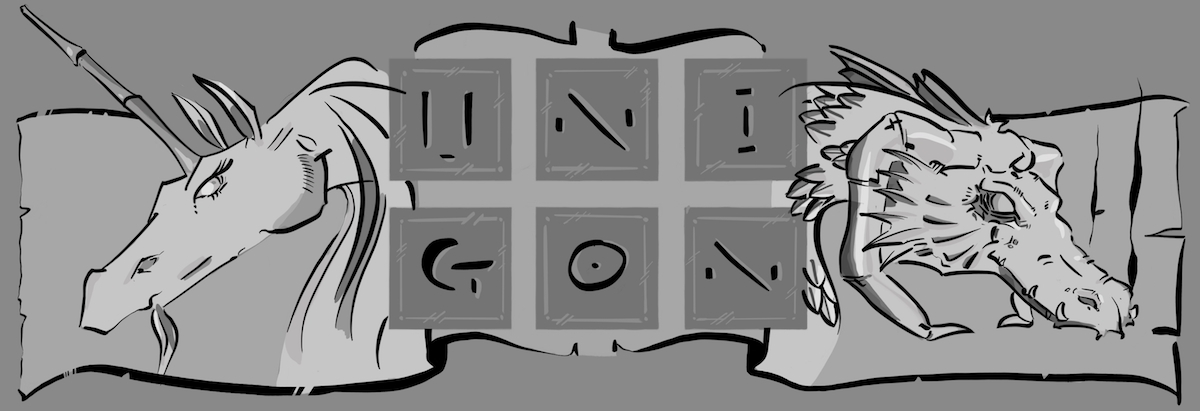
I recently completed this piece, while partly in recognition I sorta suck (technical term for not good) doing horse bodies, largely inspired by my UX design team who have everyone who joins the team draw a unicorn. I love unicorns! I have a site dedicated to them and dragons; even if I do tend to stick to the later than the former, it is right there in the name: uni(corn) (dra)gons. On top of wanting to be a part of the team, even if but spiritually, I also wanted to honor our company with our color scheme of coral and midnight blue. In short, this is part love note to all of them (they know who they are) and the company I work at. Oh, we christened our design system “Radiance” so there is that connection in the picture, too.
Sketchboard Pro with iPad Pro 12” and Apple Pencil. There is a nice tray to lay the pencil along the iPad for charging, and even a hole where the camera is in case you still want to use it to take snaps.
I wanted to take a moment to note that I finally received by Sketchboard Pro, which I’ll likely post about separately at some point. I was lucky enough to be a backer for this on KickStarter, and so received mine a little after the first of the New Year. It’s a game changer, in my mind, for anyone seriously looking for a complete digital-studio using an iPad Pro 12.9”. Combined with Apple Pencil, PaperLike for that, well, paper-like feel, and Procreate digital app, you basically have a studio for on-the-go. I have to wonder if my Wacom 22” touch Cintiq may never get used again — seriously, this is how mighty the sketchboard pro is to me. It helps bring back that feel I had as a kid with a large sketch pad. There is ample room for your arms and hands, and really allows you to comfortably put the iPad in your lap. I love that it comes with feet, too, that allows you to put it on a table and use at an angle. I highly recommend you got get it, or gift to an artist in your life (assuming they own an iPad).
As discussed in my last post, my workflow is starting to settle down. As with any workflow, there is some iteration back and forth, but largely I go serially in the following stages, or:
Concept: You will note that I’m not spending a ton of time at this step in my workflow, at least for this picture. I’ve found that you can find a lot of create concepts and inspiration from Pinterest that can get you 80-100% of the way there, especially if you’re largely doing practice pieces such as is the case with this one. As you might surmise, at this point in my artist journey, I’m more interested in just practicing specific subjects that thinking through a larger visual narrative. I fully expect this will become a bigger portion in the future when I feel I’ve mastered more of the mechanical parts around execution.
Composition: Again, similar to the before phase, I only spend a small amount of time with composition since I tend to stay true (for now) to my reference materials. You will note that I changed the position of the right foreleg in my picture, but this was a relatively straight-forward adjustment. But beyond that, this piece is largely just a study of a single reference (horse) with some additional photo-bashing of the clouds to fill things out.
Color Schema: Depending on how far off from the references I will wander with my own color schema, its a good idea to think a bit about this before you start on your values. This is largely due to the fact that not all colors are created equal when it comes to values. For instance, you cannot just magically add a color layer on top of you values and just add any color you want. Don’t believe me? Go and try it, and be prepared to be disappointed. Or amazed how complex values to colors really is. If you do not know you want that sash on your warrior to be red before you start, you will quickly realize that all those brighter values you created over hours of painstaking detailed values are all for naught when you discover that your sash looks pink, not a deep red. So it does pay to know what colors you want to use before you start laying down your values. While beyond this post, I highly recommend you check out my post on color versus values fundamentals. In this piece, I knew I wanted to use coral and midnight blue. The midnight blue requires me to either take it literally and use it as a background color (boring!), or come up with a way to incorporate into other elements. I thought the idea of a black unicorn quite interesting in and of itself, and it also solved my needs for darker values to support midnight blue. Had I picked a lighter color horse (read: traditional white unicorn), I’d never get the unicorn to incorporate midnight blue expect as some accept item.
Values, Shapes: While I’m not entirely consistent (read: happy) with how I approach the development of my values, this is where I spent the vast majority of time for any given picture: developing my values, both at phase of rough and details. Why am I dissatisfied? What a thoughtful reader you are to ask! I truly want to develop a more painterly style focused more on shapes than lines, but I’ve such a strong historical disposition toward lines that I’ve not (yet) broken myself of this preference. As such, I have a tendency to build values in a manner similar to how I approach it with a pencil, slowly with a lot of fine strokes and blurring to get the desired look; versus say a painter that starts with their shape language and blocks out subject composition and value simultaneously.
Values, Details: This is the stage I, and I think, many (most?) artists like to spend their time since all the hard-stuff such as composition is out of the way. It’s a tough balance since while details are grand, they can play counter to a more painterly approach of figuring out where to draw the eye toward with detail, versus leave out details for deemphasis. There is where the use of reference photos can be a disadvantage, depending on the depth of field of the reference.
Gradient Map: Many apps have had this feature for many years, but Procreate recently added it to version 5x. I really like using feature as you generally what your shadows and highlights color shifted toward cools and warms, respectively. And of course, you can always flip that with warm shadows and cool highlights, all without changing your values. Other approaches such as just putting a color layer on top of your values and color shifting everything toward sepia is a good compromise (and is closer to how masters of old started their paintings before adding glazes), it does require more work in the next stage of colorizing. Regardless of your approach, never ever start coloring using greyscale as your values unless you really want to get a rather unflattering and flat looking picture. Especially if your subject is humans, there is a good reason why masters used sepia tone (burnt umber) for the under layer.
Colorization(i.e. Glazing): Prior to gradient maps, this could take me nearly as much time as I spent on the values. I now find I spend the least amount of time since most of the big decisions have all happened before this phase. Furthermore, it’s pretty straightforward to start all over and come up with a completely different coloring without too much fuss, muss, or hassle. This stage feels the most like an improvisation for me, and as a consequence, I tend to not get concerned if something is not working as its painless to change.
Highlights & Tweaks: The last phase is to try to add some punch to my pictures. That said, the real challenge at this stage is to not radically change your values you painstaking established in your earlier stages. Remember, values are everything to human visual recognition so changing your values, even subtly, can alter your picture. Before careful, especially as applying color dodge, color burn, add, multiple, et cetera do affect value. That said, this can be a fun part of putting a bit more zing in your picture before calling it wraps. Given I love fantasy artwork, I’m never adverse to a bit of color dodge to make a few things pop (read: glow) a bit more.
Reference images used for this picture – Pinterest is a great resource
Composition
Values, Shapes
Values, Details
Gradient Map
Colorization (i.e. Glazing)
Highlights & Tweeks
As you can see above, I did not stray too much from my references, especially of the horse. I thought it was already a very dramatic pose, although I did reposition the right foreleg a bit. The more I look at it, I wonder if I could have been even more suggestive with that foreleg of the unicorn right between rearing up and leaping forward, but so it goes with art. You get to the finish line, only to look back and see all the things you wish had done differently.
You might have noticed that I did a lot of desaturation from the gradient map to the final version. While I really liked the deeper saturations, I felt that for purposes of providing more depth and helping the unicorn stand out that I intentionally knocked back the saturation around it (read: desaturated), especially in the clouds.
If there is anything I wish I could do differently (read: better the next time) are the clouds. I’m never satisfied with my clouds as I feel I’ve not quite mastered simplifying the shape language without resorting to something that’s too simplistic. Someday I will create clouds I’m proud of; but, this picture is not that.
That said, I’m pleased with the results. My workflow is starting to gel for me, and I feel I can work through a piece in a few casual nights now while hanging out with my partner. It feels good to complete something that fits with my original vision, and at the same time is advancing my craft.